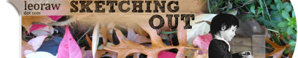
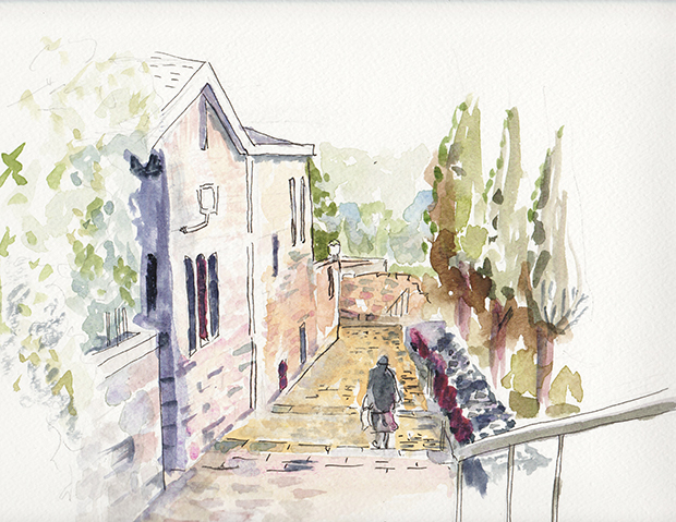
Last December we stayed in the beautiful Jerusalem neighborhood called Emek Refaim. I took a photo of the this residence with a gate and stairs. Recently, I created this watercolor. In addition to being a study of a piece of a residential area, it is a study of greens. How many greens can one create in watercolor – you can take any other tube of color, even a red or a brown, add a bit to the green, and you have a new green, often a grayer green. Stairs (with shades of brown and tan) draw the viewer into the scene.
I started posting my artwork and some photos to Instagram – feel free to follow me on Instagram. I will continue to post my favorite artwork here on Sketching Out, because on a blog it feels more permanent (though what in life is really permanent). And there is more opportunity to discuss the artwork.
If you want a good watercolor book, I recommend David Bellamy’s Complete Guide to Watercolour Painting.
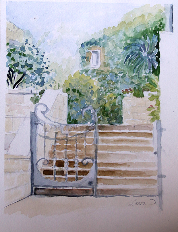
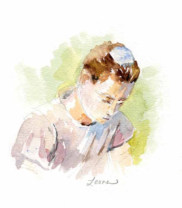
I painted this watercolor sketch of a girl praying with concentration in late December. There was a poster on the wall, and it inspired me to paint. The “concentration” refers to the concept of kavanah – כַּוָּנָה. At least to me, she does look like she is praying with intent, with feeling and emotion. Of course, we have no way of knowing for sure. But that is part of art – looking at a scene, and interpreting it in our own way.
I was pleased with the way all the white works in this watercolor sketch. I am trying to resist commenting on any piece of this watercolor sketch that I see as less than perfect.
Looking forward to doing more painting. Thank you for looking and for reading – and it is always a pleasure to get a kind comment or two.
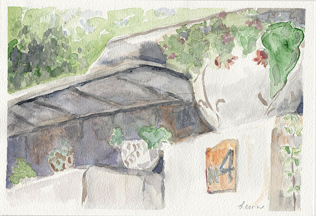
When walking around the neighborhoods of Jerusalem, one can often see flowers in a pot outside of quaint older buildings. I enjoyed converting this scene of pots with plants on a wall into a watercolor sketch.
In depicting a scene with watercolor, the artist must ask: how much do I show? What are the colors I should choose? Do I work to extend the contrasts of lights to darks or do I keep the range to lighter tones?
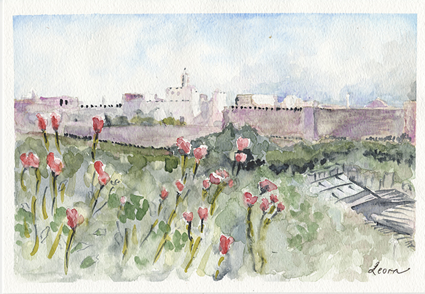
Finally, I am getting back the main reason for this blog: posting sketches of my art. Above is a scene from a neighborhood of Jerusalem called Yemin Moshe – it overlooks the Old City. I purposely chose a limited palette for this watercolor. The composition and the drawing are about where I want them to be. I will probably return to this subject and depict it again. I left the areas white that I might in the future make into a very pale gold.
Yemin Moshe was built at time before cars. There are now places to park behind the houses, but one mostly walks up and down stairs to tour the neighborhood. We visited Yemin Moshe in 2016. It is quite picturesque (and pricey as well).
When I post these watercolors, I think of the first words of the famous Naomi Shemer song:
“The mountain air is clear as wine
And the scent of pines …”
Looking forward to doing more watercolors, landscapes or portraits. Have you ever painted or drawn? What are some of your favorite subjects to depict?
Purim is on Sunday. It is one of my favorite Jewish holidays – it gives me the opportunity to be creative. The other details one needs in order to get those creative juices flowing: time, energy, inspiration.
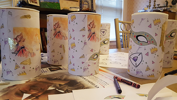
Every year for Purim since my children were little, we have decorated oatmeal containers, filled them with treats to eat, and given them out to our friends. The giving out of food gifts is specific to Purim – it is call Shaloch Manot (or Mishloach Manot) – literally, sending of gifts. This is the first year none of my children are available to help me – the two eldest are no longer living at home, and my daughter started high school with a rigorous academic schedule, a school play and a Shakespeare mini-competition. So I decided to work on the containers on my own.
Here they are so far:
I did not use any photographs as I have in the past. I covered each one with my Purim wrapping paper. I did use my Esther points at Haman watercolor illustration that I made last summer. I decided it needed something green. So last Sunday while my daughter was working on her computer on an assignment that she did not like and wanted my company, I decided to work on my computer and create a mask with some green. That’s the mask on top of this post.
Explanation of the mask: part of Purim is dressing up. It’s not at all a requirement, but many children and some adults do enjoy this part. Purim also has themes of “hidden” – there is a custom of eating kreplach, for example, which is basically a wonton (and a wonton has “hidden” meat). Esther had to hid her identity in order to save the Jewish people. When one wears a mask, one is hiding a bit of oneself.
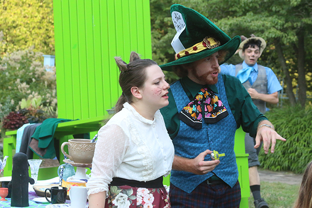
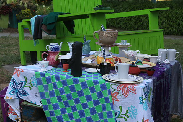
Back in July we attended a performance in Rutgers Gardens. Well, maybe performance isn’t the right word. We were told as we entered the woods on the edge of the gardens that we were Alice. Then we met characters such as the Cheshire Cat and the Red Queen. This table displayed the tea party. I really liked the set up. What do you see? I see a tablecloth that looks like a chess board. And teacups. Thank you to reThink Theatrical for a fun evening.
The Dormouse and Mad Hatter were right next to us. In the photo you can see the March Hare approaching. The large green chairs are part of the regular Rutgers Gardens display.
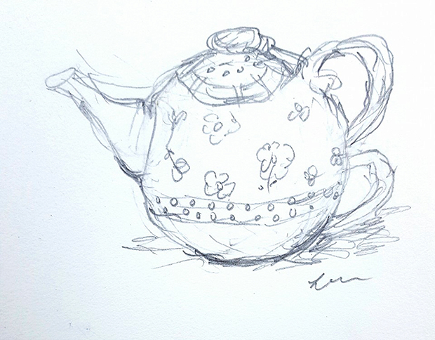
A friend posted her colorful teapot on Facebook this summer. I was inspired. I had a busy summer of work and family events, but while riding as a passenger in a car on the way to see my daughter perform in sleepaway camp as the Wicked Witch of the West, I produced this teapot sketch:
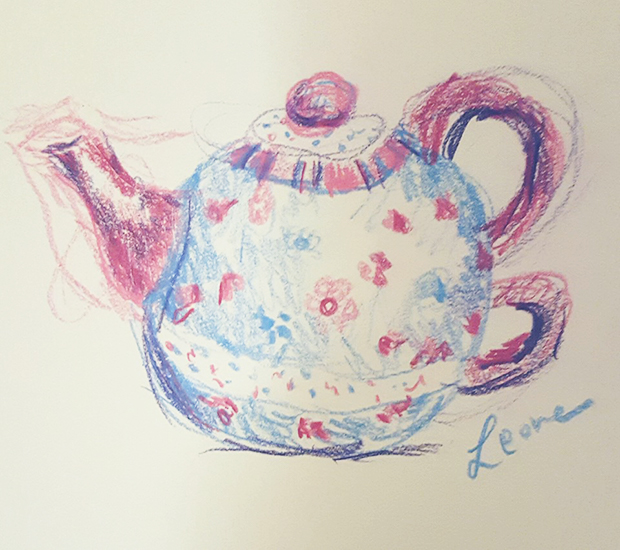
A few weeks later while in a hotel room I did a colored pencil sketch of the teapot:
I am a fan of fanciful teacups and teapots – to sign up to read more of these posts by email, please click on the teacup in the sidebar of this blog (should be down at the bottom if you are reading on a phone).
Thank you for visiting – I plan more sketches in the future!
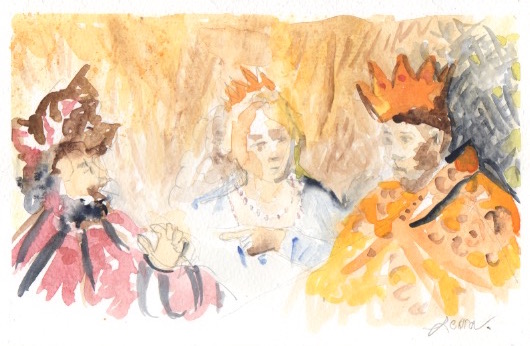
I started this sketch of Esther pointing out Haman to Ahashverosh of Persia way back in December. It is based on an old painting – if you want, you can look it up. I liked the idea of the boldness of Esther. Is she someone to emulate? Can we find evil and point it out? Even if it means risking out lives?
The story of Esther is told at the Jewish holiday of Purim, which usually falls in the early spring. So you would think December would be enough time to finish a sketch? Mind you, this isn’t a full-scale oil painting, although I think portraiture (especially three people) is much easier in the medium. Well, December rolled in January and February, when I went with my daughter to Israel. Then I got offered some great website work when I returned … I am still working quite a few hours a week for a school at Rutgers University. Fast forward … daughter went to camp, husband took son to college orientation in Maryland. I’m home alone … what do I pull out, but this painting! Started it again. The first time Haman turned out like a blob of black. I intended to give him a three-cornered hat instead of the Dutch feathered cap in the painting I used as a model. Maybe next time.
I will now spend a bit of time poking around for inspiration for a new watercolor sketch. Suggestions welcome.
Portrait of a Young Man, watercolor on paper by Leora Wenger 2015 January
More in my “young man watercolor portrait” series – I have to enjoy my sons while they are home! One son is “visiting” from college, and he is applying for internships, so who knows when he will get a yes and off he will go again. My other son is applying to college and programs in Israel, so he, too, won’t be living at home forever. When they sit at the dining room table looking at a laptop or a tablet, at least they don’t mind too much if I paint them.
Hope to post some bird pics next week. Coming up soon is Shabbat Shira. Maybe I will even write a new post on Why does one feed the birds for that parsha? (and of course, if one starts feeding them, one should continue, right?). I noted on that old post from 2010 how to attach the suction cups to the window; one came down yesterday, and I had no luck. Maybe I’ll bring it inside and follow the instructions (soak in hot water, dry, rub with them, then attach).
Meanwhile, would love to hear any reaction to my watercolor.
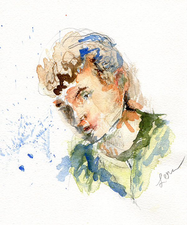
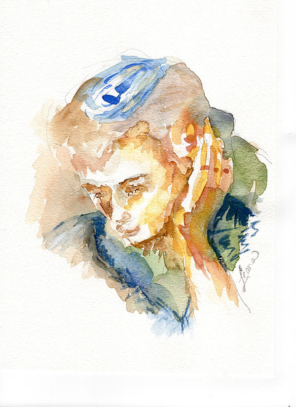
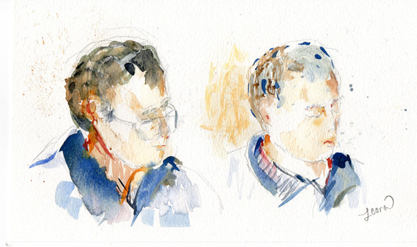
I did two more watercolor portraits last week. The emphasis here is on form and color – I’ve not spent too much energy on achieving likeness. I’m hoping that I will continue to do a few more portraits, but it’s hard to get ones that are satisfying. I did a few drawing portraits, but nothing I liked enough to share.
I did the bottom one first, then I painted the top watercolor portrait. These paintings have more color than the previous ones I painted.
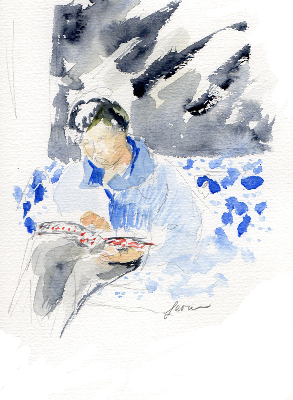
I did several watercolor paintings of this exercise: ” “Use a graphite pencil to draw a few lines … do notice the lighting hitting the face… Take your watercolor and add a few large shapes. Let dry; add other colors on top…play with different color and texture combinations.” I posted three of them in reverse order of when I did them (I did the bottom one first). Watercolor exercise is from the book One Watercolor a Day.
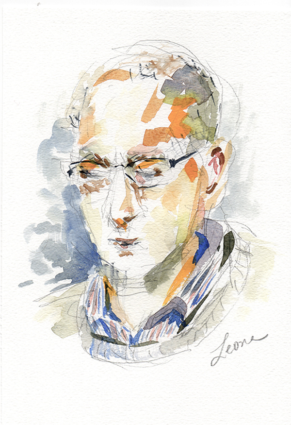
All of the remaining three portraits on this page are different depictions of my husband. The top one is not – he was a visiting friend. Our friend liked his portrait so much that he asked if he could keep it. So I scanned it into the computer and then presented the watercolor to him. Wonder if he will hang it in his office?
This is the first one I did – it has the least amount of color. Plus, I realized the exercise was really a portrait, and I had done the whole figure. What I really want to focus on here, in this bottom watercolor, is the book. Do you see the splatters of red paint along the spine? This book is a chumash (one of the five books of the Torah). It happens to be part of an edition of volumes that was presented to my father z”l as part of being honored by the Highland Park Kollel. That gives it special meaning, and I am happy to see my husband using that volume as part of his weekly learning.
I think I will do more watercolor portraits. By the way, if you come visit on a Sunday or weekday and start to read a book or your laptop, I might take out my paints, pencils and watercolor paper and start to paint you. You have been warned.