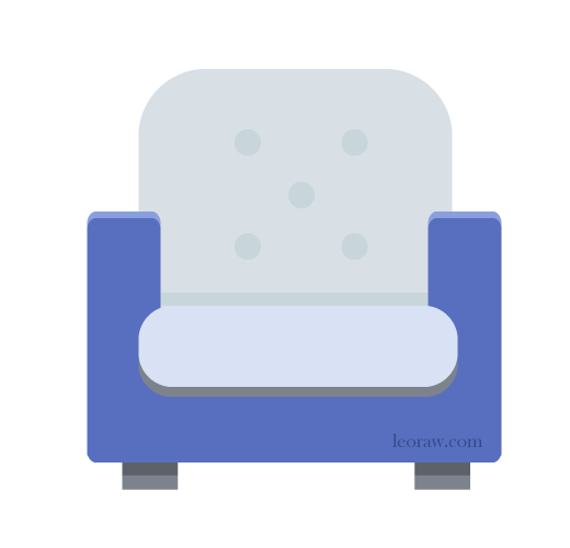
Flat Design: Armchair

What do you see in the above illustration? Does this look like a flat design armchair? (I looked up armchair – it is truly one word). Does it remind you of any particular profession? What does it evoke?
I have been redoing my website, the main part of my site in which I sell my web services such as WordPress training and small business web development. I decided a little illustration would be nice for my new Services page. Of course, the illustration itself is the hard part … I already fussed a lot over the illustration for the home page.
So one idea is to have little balloons or circles with flat design illustrations that represent some of the businesses or organizations for which I do websites. Maybe one might look like this:

Or like this:

I may just toss the circles all together. Meanwhile, I need to come up with a few more flat icons / illustrations to put together in one illustration. Ideas: pen and ink, camera, piles of books, light source from a lamp …
Anyway, that’s what I’ve been fussing over today (in between helping various clients with various issues). The main question for you is: Does the arm chair illustration remind you of any particular profession? Or can you think of any professions I might illustrate with a simple flat design of some sort?

Daniel Saunders says
It makes me think of counselling or therapy. Maybe that's just because Wednesday is my therapy day. I'm not sure I would have thought of it if you hadn't asked the question, though. I think my initial reaction was just, "Armchair."
leoraw says
Daniel, you got it! Interesting how evocative a simple image can be. I've done a number of websites for therapists, so in addition to doing academic websites, therapy websites are becoming a bit of a specialty for me.
Now I just have to think of a few more simple illustrations that would make sense with an armchair ...
Susan Cooper says
LOL, your illustrations reminds me of my dad's favorite chair. The shape was the same but the color of his chair was an ugly green. Even so it brings back good memories. :-)
leoraw says
Glad it is comfortable and inviting - a web illustration for services should be! Now I just have to come up with a few more comfortable icons ...
Michelle RW says
Yes, therapy .... or a nap... LOL
leoraw says
Napping is good! Thanks, Michelle.
Vijay Shah says
Leora.
I think this armchair design is really nice. Simplistic and the illustration is so inviting. As for the sort of place perhaps you would find such a chair, I'd say probably a swanky media office or possibly a dentist's surgery.
I could easily fall asleep in it, as well.
Vijay
leoraw says
Vijay, glad it is inviting! Now I just need to come up with four more (for a long horizontal illustration). My next one is going to be a pile of books; that could be a library or an academic website, both of which I have done (more than once).
Lorri M. says
I am with Daniel, on that one-an armchair in a therapist's office. I thought of it before I looked at anyone's answer.
I like the tones and contrasts in the first armchair. They are not intimidating or harsh, and are soothing, in my opinion. I like the fact it is on a white background. I like how it looks in flat design.
Hmm, circles surrounding a square with a projected triangle...I think the circles detract, but that is just my opinion.
Ahh, I would love to sit in that armchair...while reading a book...
leoraw says
I started working on the other four icons - I like having them in circles, to group them together. But it seems that the white box with the triangle (supposed to "speak" - does not seem to be) is not working at all.
Working on a group of designs is not easy. Thank you SO much for all the detailed feedback. I love it.
Lorri M. says
Oh, I forgot to mention, that the plump-looking pillow is verrrry inviting and comfortable-looking.
Lorri M. says
On second thought, the circles don't really detract. I see that the triangles made it seem that way to me. Maybe if you soften the gray and the blue backgrounds the triangles won't appear so harshly?
leoraw says
OK - I need to do this with four others. So far, I've only done this one and one more (a pile of books). I will probably put each one in a circle and scatter the circles in a long horizontal image. Maybe I'll send you an email next week with more details. I appreciate the careful attention!
Lorri M. says
No problem on the email...you know I am always here...
I have to run to Synagogue-Shabbat Shalom.
Please leave a comment! I love to hear from you.